How can an established brand update its look without losing the qualities people recognize? For Alfajores del Tucumán, the process began with its history: a family business founded in 1970 and connected to the flavors of the region.
The goal was to translate that heritage into a clear, flexible visual identity that could work across different products and their packaging.
The brand, then and now
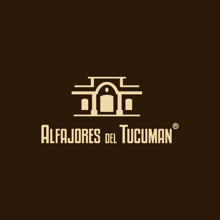
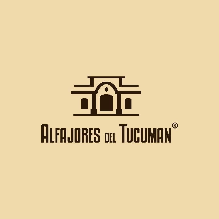
The redesign keeps a link to the brand's history while simplifying its elements: the illustrated composition gives way to an architectural symbol and a more legible wordmark, designed to work at different sizes.
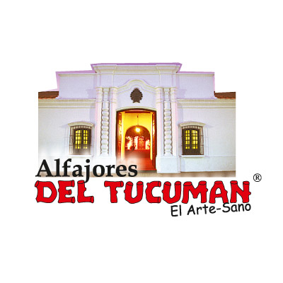
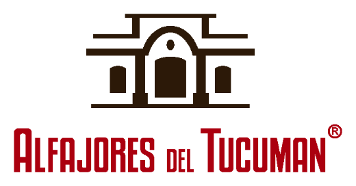
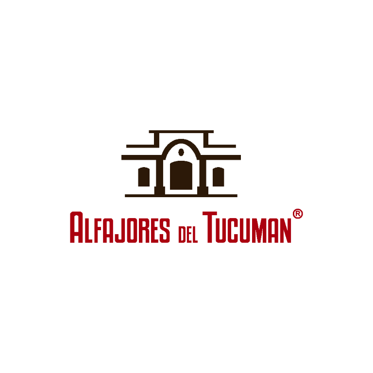
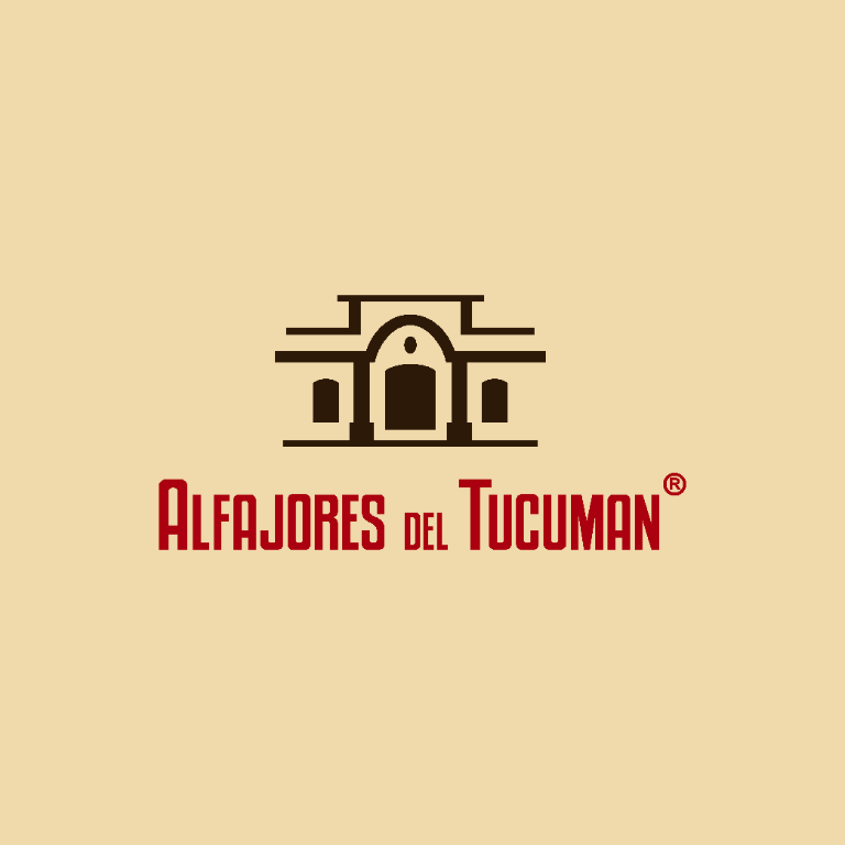
The new identity keeps its connection to Tucumán and the brand's history while using simpler, more versatile forms. The redesign also introduced logo variations that adapt to the backgrounds and applications of each product.
An identity inspired by Tucumán
The symbol takes inspiration from the architecture of the Historic House of Independence, one of Tucumán's landmarks. Its simplified form connects the brand to its local roots and remains legible at small sizes, including on product wrappers.

Typography and color: a recognizable system

The Kenyan Coffee type family, in upright and italic styles, gives the brand an expressive, recognizable voice. Its tall, condensed forms help the brand name and each flavor stand out on the wrapper.
The palette combines four tones—warm beige, yellow, cocoa, and burgundy—to add contrast across applications while keeping the overall system cohesive.

A system for different varieties
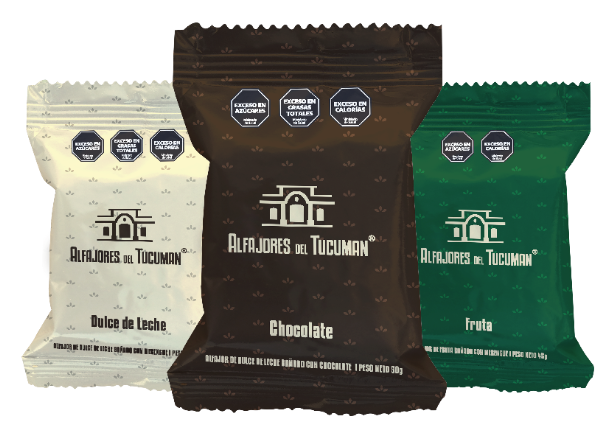
Rather than designing each wrapper in isolation, the project builds a visual family. The chocolate, dulce de leche, and fruit varieties share the brand's core elements and use distinct color codes. Each product is easy to identify while still feeling part of the same range.
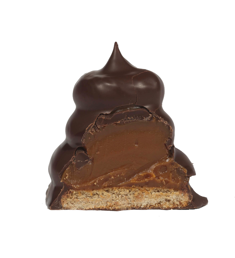
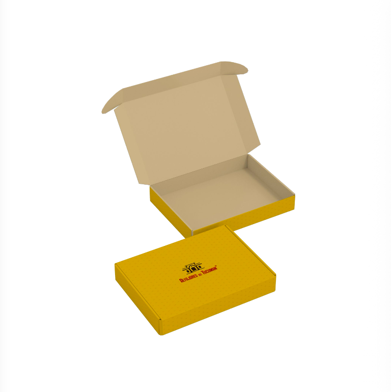
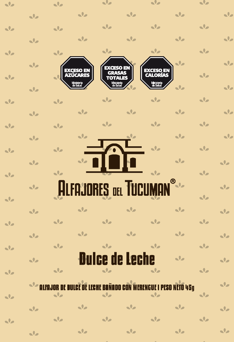

From concept to packaging
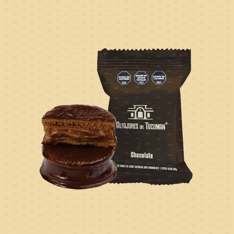
The system keeps the core brand elements consistent and uses color to distinguish each flavor. This makes the varieties easier to identify while helping the products read as one cohesive range.
From individual wrappers to the presentation box, the identity brings together references to Tucumán, clarity, and a cohesive palette.
The Tucumán-based publication El Tucumano has covered the family story behind the business. To learn more about Alfajores del Tucumán, visit its official Instagram.
Ready to refresh your brand identity and carry it consistently across your products?
Grow with us