On a crowded shelf, packaging needs to catch the eye and quickly help people understand the product. For Madomi, the challenge was to bring a broad range of foods together without losing the brand's personality.
Madomi makes fresh pasta in San Miguel de Tucumán. On its Instagram profile, the brand invites its community to share recipes and tag the account. That connection with people who enjoy its products informs the visual challenge: bringing different varieties together under one recognizable identity.
Across the packaging pieces, red and green, the Madomi character, and the wordmark work alongside product names, varieties, and package information. Together, they show how the information is organized and which visual cues make each design recognizable.

A brand recognized at a glance
The wordmark and character act as recurring reference points across the packages. Strong colors help distinguish the brand, while the name of each variety takes center stage.
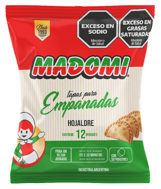
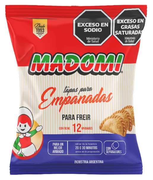
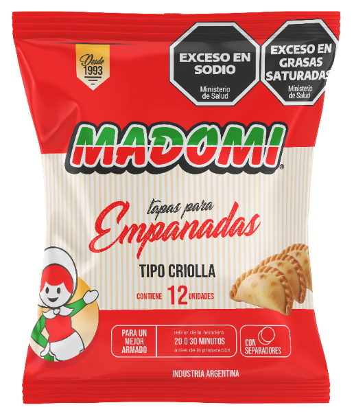
Empanadas: three varieties, one product line
The three packages share the same structure and brand cues. The variety name and color accents help distinguish each option without losing the line's visual unity.
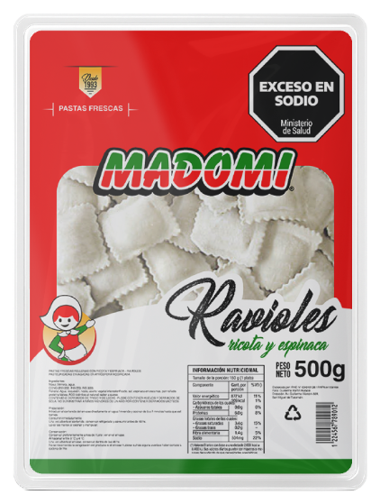
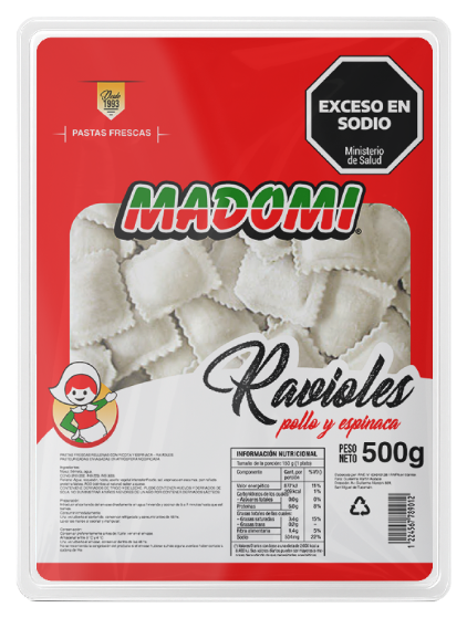
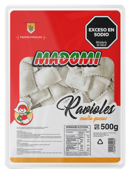
Pasta: the ravioli package
The ravioli line applies a shared structure to three varieties: the brand, product window, and package information stay consistent, while each flavor's name and color set it apart.
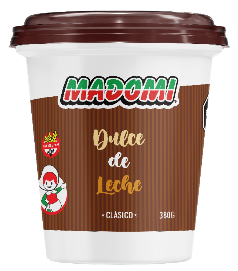
Dulce de leche: two sizes, one identity
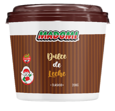
Both tubs retain Madomi's visual cues while adapting the composition to each format. The size difference shows how the brand is arranged on each package.
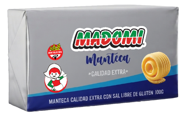
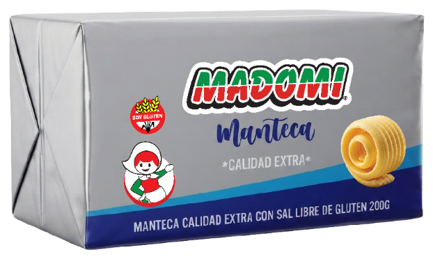
Butter: 100 g and 200 g formats
The butter line has its own horizontal package design. The 200 g format extends the 100 g presentation while keeping the wordmark, character, and blue palette.
A visual system that works across products
The design balances consistency with distinction. The brand remains present throughout the line, while color, typography, and product imagery help people identify each variety.
Look closely and each decision—from the wordmark's scale to the placement of package information—helps make the packaging clear, recognizable, and cohesive as a family.
Want your packaging to tell your brand's story more clearly?
Let's talk about your project