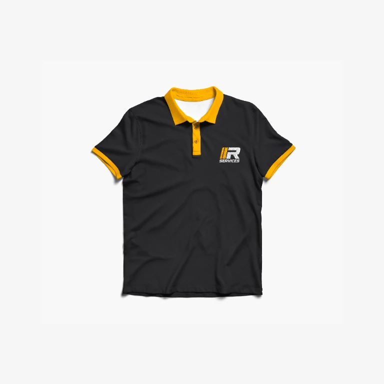
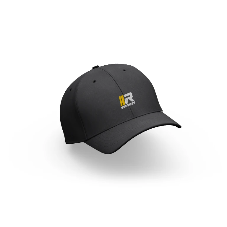
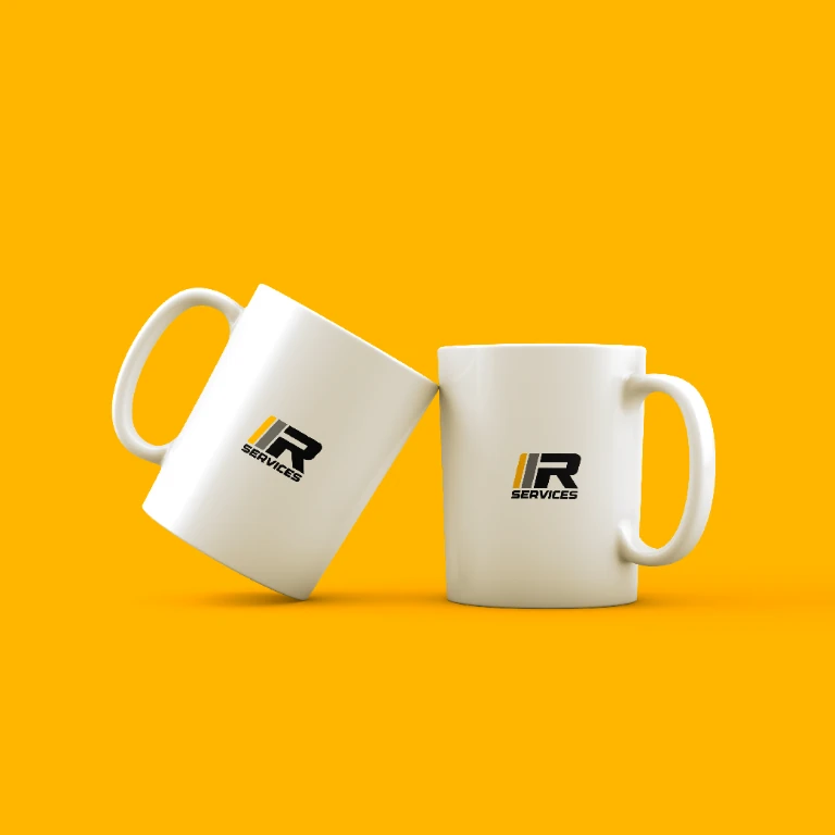
A visual identity for an automotive business needs to feel clear, solid, and easy to recognize in different contexts. For Rudy Services, an automotive service company in San Miguel de Tucumán offering light mechanics, parts, oil changes, and tires, the challenge was to refresh the brand while retaining its connection to the automotive world.
From an illustrated emblem to a direct mark
The previous identity centered on a portrait inside a circular badge. The new proposal replaces that illustration with a geometric “R” alongside two slanted bars and the Rudy Services wordmark: a more streamlined, sporty signature that is easy to recognize across sizes and applications.
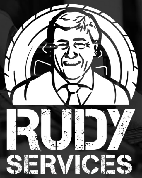
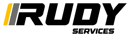
The redesign reduces detail in the emblem and focuses recognition on the initials and name. Slanted lines, bold typography, and yellow reinforce a sense of movement connected to the automotive field.
A palette built on contrast and energy
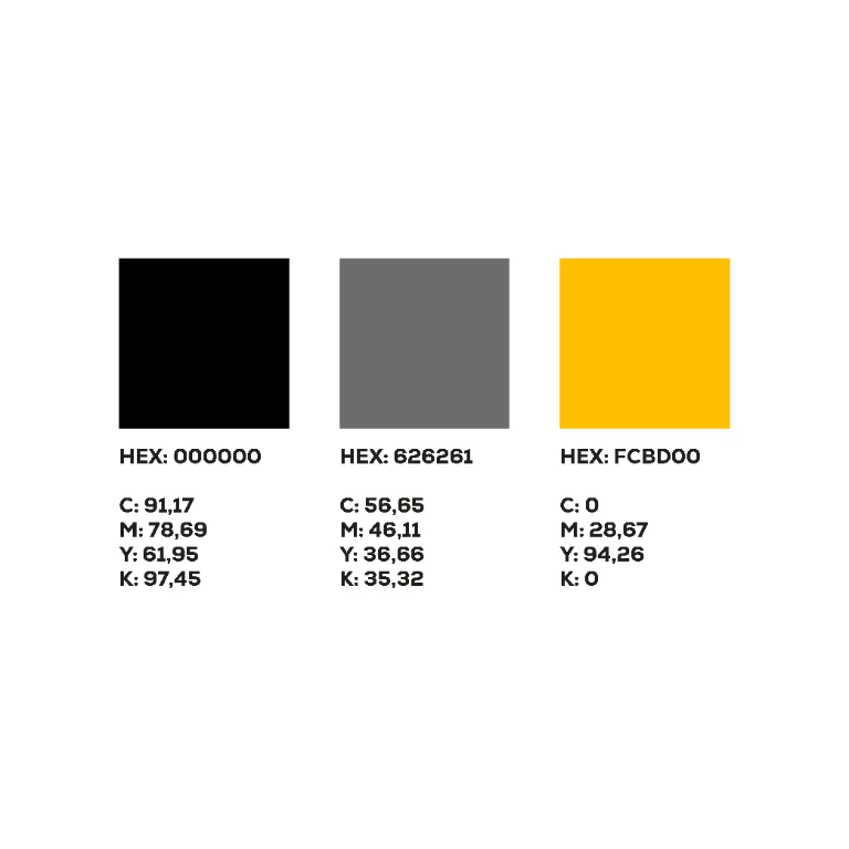
The system uses black, gray, and yellow. Black adds presence, gray brings a technical tone, and yellow works as a high-visibility accent. Together, they create a recognizable identity on both light and dark backgrounds.
Identity applications
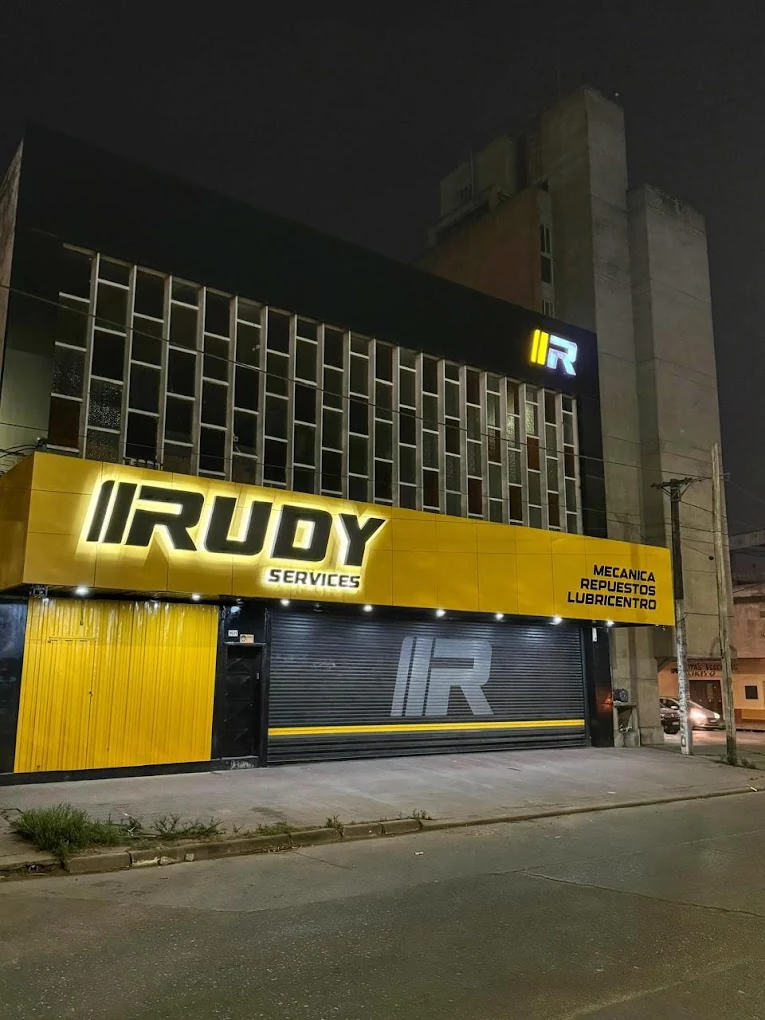
The system extends from the storefront to workwear and everyday objects. The real storefront shows how yellow makes the business stand out; for garments and accessories, mockups explore more compact uses of the symbol.
Storefront
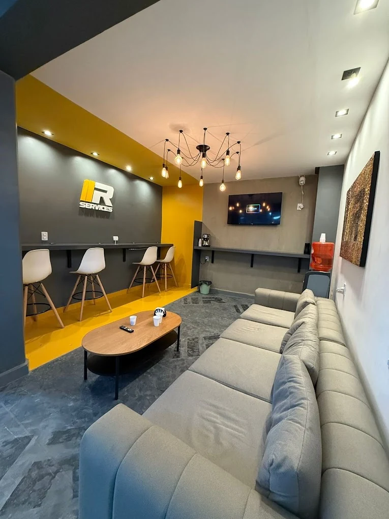
Waiting area
Workwear and objects