For a brand connected to vertical movement, a symbol can tell a story before the name is even read. For Tecnolift Elevators, a Tucumán-based elevator and lift company, the new identity puts that idea at the center of its visual system.
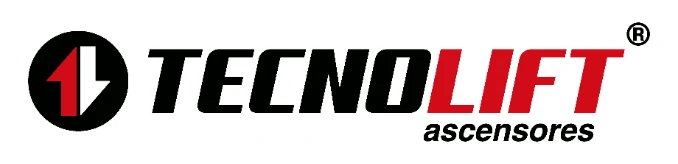
The mark brings together two directional forms within a circle, a graphic shorthand for movement between levels. Paired with the name, the slanted type adds rhythm and a technical, dynamic presence.
From the previous logo to a new identity
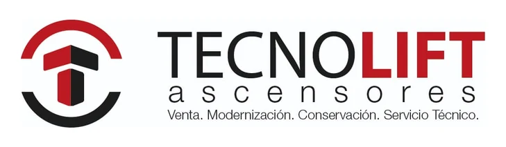
The previous identity combined an open circular symbol with the company name and a descriptive tagline. The new proposal keeps the association with vertical movement and gives it a more compact form: two contrasting shapes inside a circle paired with sporty, slanted type.
Color and typography with character
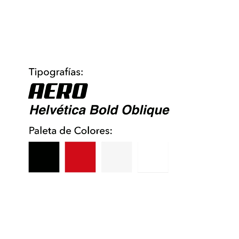
Black adds solidity and contrast; red brings an energetic accent, while white preserves legibility on dark backgrounds. The selected type pairs a sporty display face for the name with a bold italic sans serif for “elevators.”
A brand designed to stand out in its surroundings
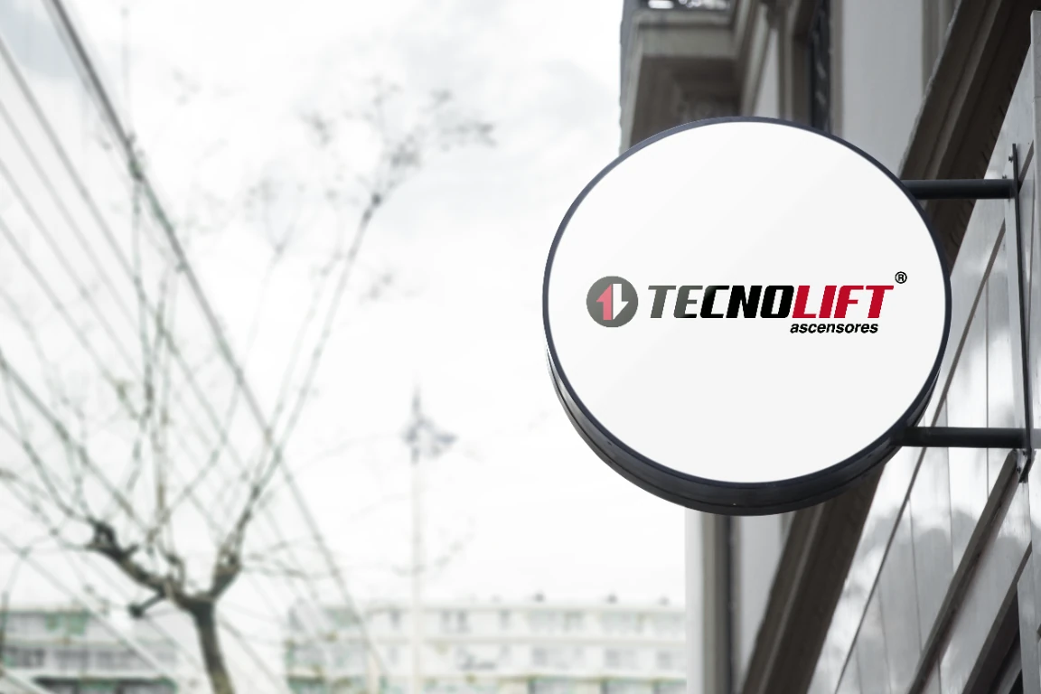
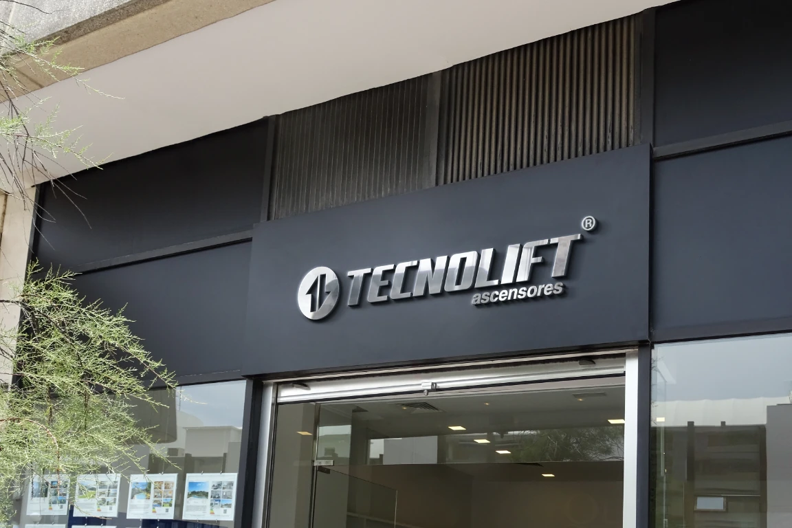
The manual's applications show how the logo can work on an outdoor sign and a storefront, adapting to both light and dark surfaces. These are concept mockups included in the presentation and do not confirm that the signage or storefront has been produced or installed.
The identity across communication pieces
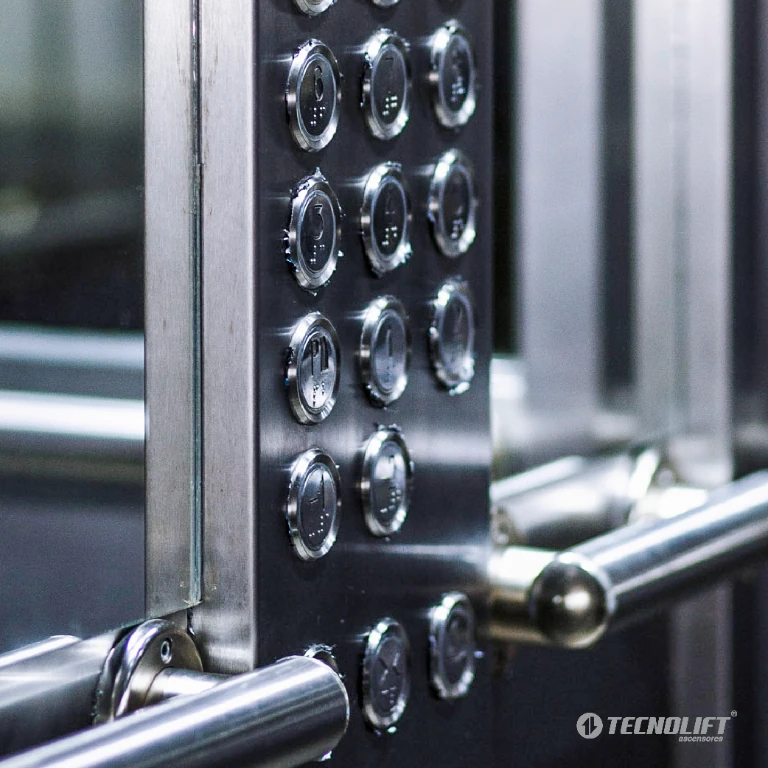
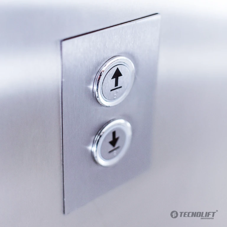
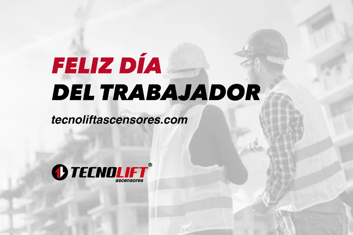
The shared posts show how the brand appeared on social media: the Workers' Day greeting combines the logo and typography with a themed photograph. The 2022 images, by contrast, focus on elevator details and carry the logo as a watermark.
Elevator details in 2022 posts